Median Household Income
Above: Year by year median household income for NY's metro area

Above: Median household income in tabular form
For every dollar the state average income increased, Kings County increased $1.71. The immediate area benefitted similarly, increasing $1.47 for each dollar the state increased. Overall, that must be considered a good thing for the area, although the rest of the numbers don’t look nearly as positive.
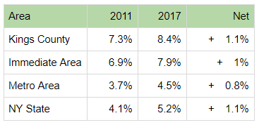
Poverty Rate
Above: Year by year poverty rates for NY's metro area

Above: Poverty rates in tabular form
Unfortunately, Barclays Stadium has not alleviated local poverty issues. The local poverty rate ticked up from 19.5% to 21.6%, which was worse than NY state. Toward the end of the time period, the rate of increase went up, indicating that the gap may be widening. This is more troubling when considering the 5 year basis of the ACS data - 2017’s data is the first set that was gathered entirely after the construction of Barclays.
SNAP
Above: Year by year SNAP use for NY's metro area
Above: SNAP use in tabular form
Usage of SNAP in Kings County is substantially higher than the state on a whole. It is notable that the entire state increased in SNAP usage, but Kings County trended downward from 2016 to 2017, which may indicate improved economic performance in the future.
Unemployment
Above: Year by year unemployment rates for NY's metro area

Above: Unemployment rates in tabular form
The unemployment rate in Kings County closely mirrored the state, making it difficult to discern a benefit in the availability of jobs. Local Unemployment increased at first, then ticked down from a high of 5% to 4.1%. In a reversal of the expected effect, Kings County underperformed in comparison to the surrounding areas.